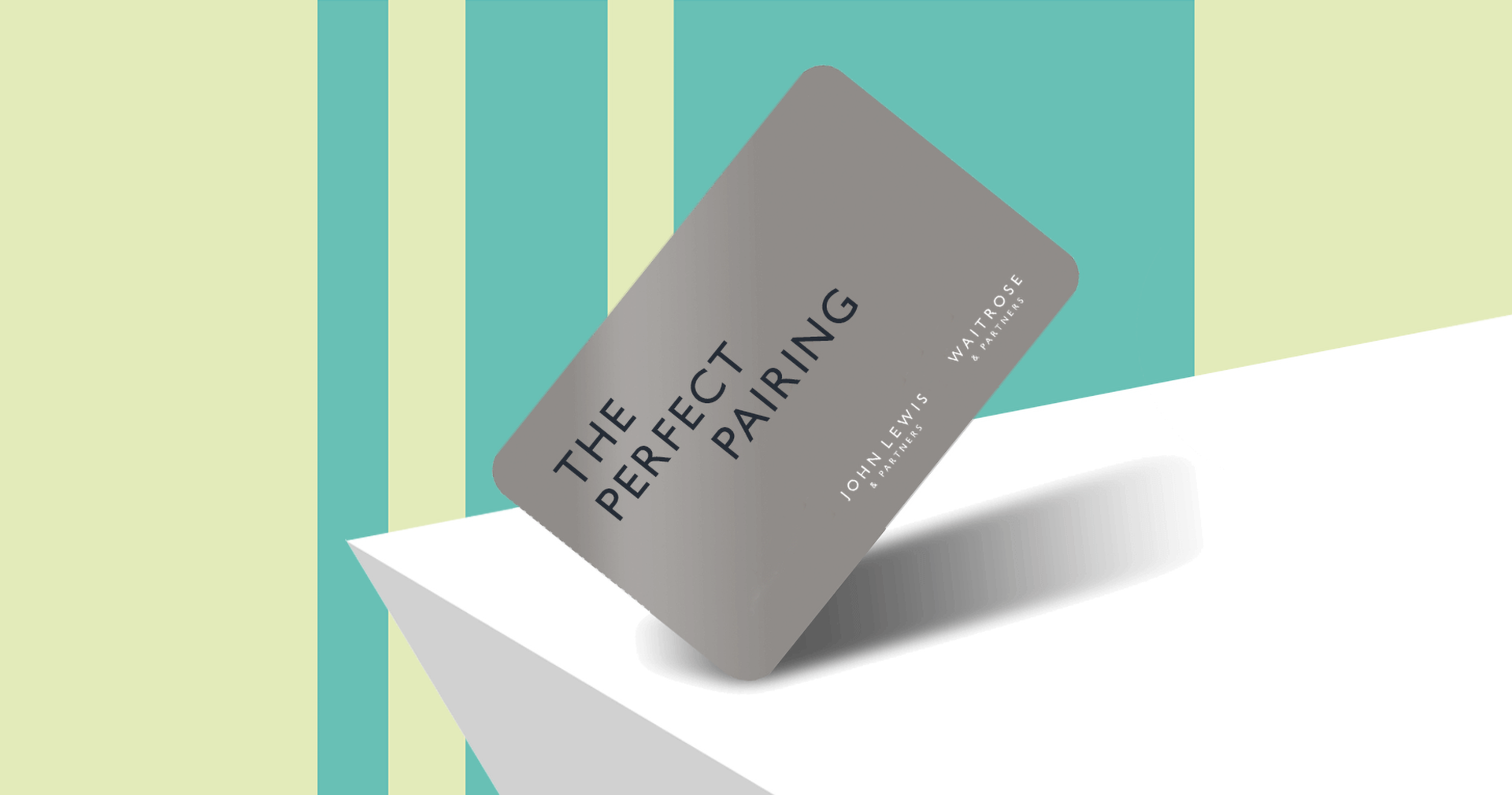
Perfect Pairing –
John Lewis and Waitrose
Brief: Waitrose was to begin offering John Lewis products in store by way of display units in aisle toward a large dedicated space at the back along with a community space. The project needed to highlight the quality and special feel of John Lewis with the convenience and warmth of Waitrose.
Approach: Working closely with Pentagram and Store Design, we recognised that familiarity of the two distinct brands was key so it was about bringing the two together in a seamless way without conflict or clash of visual treatment but not recreating something entirely new. It was also just as much about the choice of language so I worked closely with the editor in chief around this idea of ‘perfect pairings.’ The photography then reflected this and I scamped up images of Waitrose and John Lewis products in situ. I also really wanted to bring the customer into the heart of it so all shots included hands of people making the food.


Perfect Pairing
Role: Lead Senior Designer working with Head of Design, Design Manager, Store Concept Designer, Editor-in-Chief, Junior Designer, Image Director and Harry Pearce, Pentagram
Responsible for: concept, comms language, hierarchy brand and visual identity – dual lock-up development, visual language, colourways, external/internal signage, window and wall vinyls, posters, wayfinding, digital screens, POS scamping and photography direction